
Fifty Clubs That Never Existed
Every club in 90 Minute Manager is fictional, and every badge was drawn by hand to make you forget that. A tour of the pyramid, one crest at a time.
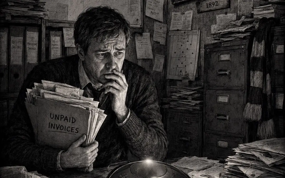
There is a moment in every run of 90 Minute Manager where the fiction either holds or it doesn’t. It’s usually a fixture list: your club’s badge sitting beside six others, and your eye reads them the way it reads real football, checking who’s dangerous, who’s beatable, who you hate. If those badges feel like clip art, the whole game collapses into a spreadsheet. If they feel like clubs, you’re a manager.
So we treated the fifty club crests in our fictional pyramid as load-bearing structure, and drew every one of them individually. This is the story of how, and a tour of the ones we love most.
The rules of the drawing board
The style target for the whole set is modern-vintage English football heraldry: flat vector, two or three colours, bold silhouettes, no gradients. The kind of badge that looks right on a 1970s programme cover and an app icon at the same time.
Underneath the romance, the brief is ruthless. Every crest must pass a small-size test: identifiable at 24 by 24 pixels by silhouette and colour alone, because you’ll mostly meet it beside a fixture in a list row or a match header. Colour discipline is absolute: each club’s two kit colours plus at most one neutral, so the game’s interface can theme itself around the club you manage. Shapes have to vary across a league, pointed shields, roundels, ovals, hexagon plates, gothic arches, and no two clubs in the same division are allowed to share both shape and layout. Playable clubs get the biggest detail budget; opponents simplify to one charge and a border.
Then, inside those constraints, every club gets a story told in linework.
The clubs you manage
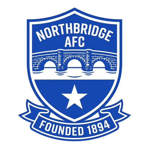
Northbridge AFC, royal blue and white, carry the game’s free challenge and its plainest heartbreak. The shield splits in two: the top half a stone arch bridge crossing a white river band, the bottom half solid blue with a single white star. The star is the point. It’s the one thing the fans still believe in. The whole crest is meant to look honest, working-class and slightly weathered, a badge that has seen better decades, because in The Northbridge Rescue, it has.
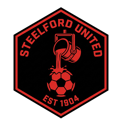
Steelford United got the set’s most radical decision: no shield at all. Their badge is a hexagonal factory plate with rivet dots around the border and a crucible pouring molten steel that flows into the shape of a football. The design note that survived every revision reads: it should feel stamped, not drawn. Steelford’s whole story, a promotion push powered by a furious, sold-out fanbase, is in that distinction.
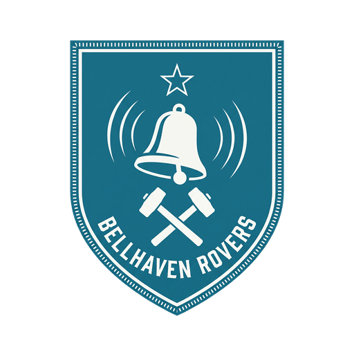
Bellhaven Rovers, the impossible title-chasers of Champions on a Shoestring, wear a church bell mid-ring above two crossed foundry hammers, a nod to their ground, The Foundry. Look closely above the bell and there’s a tiny empty space where a champion’s star would sit. It’s deliberately blank. For now. It’s the cheekiest detail in the set, a small club quietly measuring itself for silverware it has no right to expect.
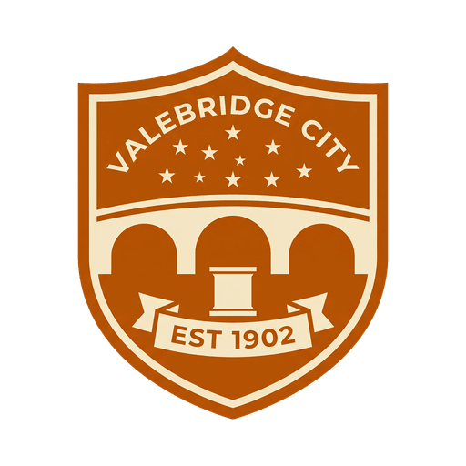
Valebridge City carry the saddest badge in the game. After the King is a challenge about replacing a legend, and the crest grieves with it: a grand three-arch bridge in amber with an empty plinth on the central pier. The statue is gone; the space remains. Above it, the retired number 9 hides in the sky as a constellation of nine stars. Prestige serif lettering, warm cream field, grief and grandeur in one badge.
Brackenhulme Town are 134 years old and dying, and their crest had one job: look like something worth saving. It’s the only badge in the set that’s meant to look genuinely old rather than styled-old, a worn shield with a tannery hide stretched on a frame, a leatherworker’s blade crossed behind it, the founding date prominent underneath, edges deliberately distressed. When Administration Watch asks you to keep the liquidators out, this is what you’re keeping them out of.
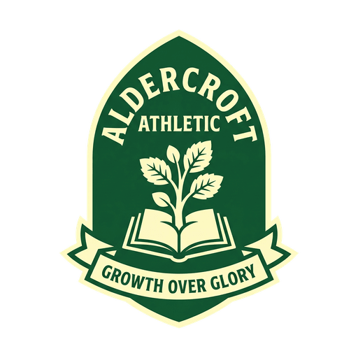
Aldercroft Athletic, home of The Youth Project, have a young alder sapling growing out of an open book, inside a shield shaped like a gothic arch window. The five leaves are each a different size: the age groups. The brief asked for a school badge that grew up into a football crest, with a motto ribbon that translates roughly as growth over glory. It’s the gentlest badge in the game, which makes it very funny when Aldercroft’s kids ruin your afternoon.
The villains and the scenery
The opposition badges carry just as much intent, because rivalry needs a face. Marlington City, the establishment villain of the Shoestring story, wear a gold lion on midnight navy with sponsor-friendly symmetry, confidence worn like the league is already won. Kingsmoor United’s oversized three-pointed crown floats above black moorland with thin gold keylines, arrogant old money in badge form. And somewhere in the lower leagues, Ravensmoor FC’s raven, mid-takeoff on an amber disc, remains the away crest everyone secretly thinks is the coolest in the league. We wrote that into the brief as an instruction, which may be the strangest sentence a designer has ever received.
Some of the quietest ones are our favourites. Harwick Vale: a valley cut into slate grey with an orange harvest moon sitting exactly in the notch, described internally as the crest equivalent of an away win in the rain. Ellersby United’s elder-tree roundel was designed to be, and this is a direct quote, forgettable on purpose. Mid-table in crest form. A believable pyramid needs those clubs too.
Why it’s worth it
Fiction was the right call for this game for practical reasons (real leagues come with licence lawyers) and for creative ones: our clubs can nearly die, sell their souls, or refuse to, because they’re ours. But fiction has to pay rent. Nobody arrives caring about Bellhaven Rovers the way they care about a real club, so every scrap of authenticity has to be manufactured and earned: the founding dates, the ground names, the colour discipline, the empty star.
The payoff is that the universe holds together across stories. The clubs you meet as opponents in one challenge turn up years later in the Super League of The Full Season with their histories intact: Northbridge forever the club somebody once saved, Steelford still carrying the chip from their promotion, Ram City the fairytale that refused to end. When you’ve played a few challenges, a fixture list stops being a list. You scan it like the back page of a local paper, and somewhere in that scan, fifty clubs that never existed start to.